Brecon Beacons
+
SMALL BACK ROOM
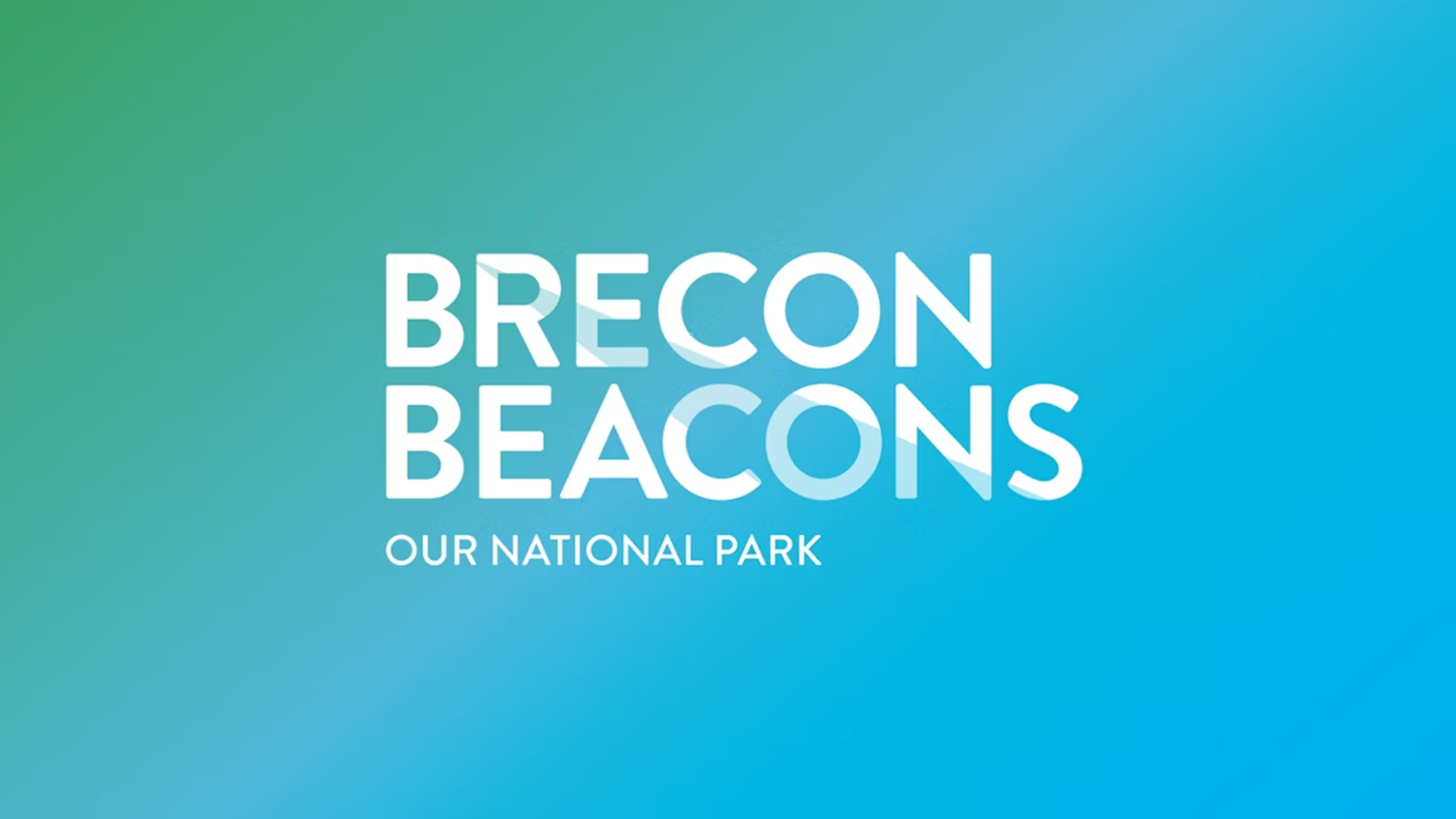
Brand identity for the Welsh national park the Brecon Beacons, basing the designs around the ideas of light and the thought ‘Our National Park’.
The brand sits alongside that of the NPA, aiming to more clearly define the Brecon Beacons as a destination in its own right.
Jo Morris, NPA director of communications, says, ‘The people who live and work in the park wanted to associate themselves with the area. In 2010 Visit Wales designated the Brecon Beacons as a destination, so that added the pressure to create a brand.
‘Key to our research approach was to work with stakeholders to define both the physical and emotional attractors of the place.’
It was decided the Brecon Beacons’ character was, says Small Back Room, ‘A natural place with a colourful spirit. Where creativity comes naturally and creates unexpected everyday joys. Where people live in partnership with nature and she rewards by sharing her beauty and secrets.’
The look and feel was informed by this definition, taking the idea of light as central to the branding. The logotype was designed to be used in both English and Welsh languages, as the colour palette is deliberately varied to allow the branding to be used as easily and widely as possible.
‘The big rule was flexibility’, says NPA’s Morris. ‘We want as many people to use it as possible.’
The new look was first used in brochures, and will be gradually rolled out across consumer brands from the area and materials from local authorities, the tourist authorities and local businesses.
+
Client: The National Park Authority
Project: Brand Identity. Campaign, site and app style guidance..
Agency: Small Back Room
Role: Consultant Creative Director
Team: Small back room creative team
Date: 2014
Region: UK